 I saw this recent post by arch-designer Michael Bierut and wanted to add my own comment.
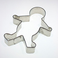
Like us here at Quoin Design, Bierut has had enough of the legion of faceless, genderless, ageless, raceless representations of people in logos. They’re sort of beefed-up, slickified stick figures that are meant to stand in for you, me, and everyone else.
Logo designs like these usually leave me feeling slightly alienated and pandered to. They say, rather than including everyone, that the company or organization sees me, not as an individual, but as a nameless being interchangeable with another 3 billion or so.
Part of the problem lies in the drawings themselves. The limbs are attenuated, sharpened, floppy or stiff. Deprived of life, we see our reflection in them, but uncomfortably.
As designers, Quoin avoids sprites. Rather than representing a person, we prefer to create a connection between the viewer and the logo. This can be done by just creating a design with tension between positive and negative space (such as Hamish Murray Construction), which draws the viewer in and creates a lasting impression. Or more directly through an appeal to the senses, such as the warm wood texture in RSN Radiology.
If we are called upon to represent everyone, we prefer to turn the question around and ask how can we allow everyone who sees the logo to feel a part of the organization? We want to do the best job we can of reaching out to our audience, and that’s not by telling them that they all look alike.