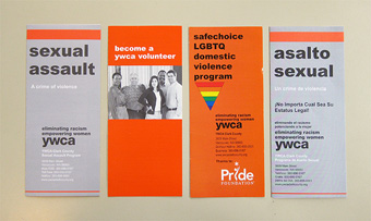
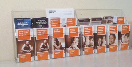
ywca clark county approached us for a wide-ranging rebranding effort. Part of that was to redesign their brochure system. These pieces are the front line for this non-profit in fulfilling their mission to help individuals in crisis. We were given the mission of working within their existing corporate identity.
As you can see from the ‘before’ image, the system had suffered a range of variations due to organizational changes over the years. The result was an incoherent look that seemed messy and disorganized. We also energized the layout while prioritizing easy comprehension.
We did take one liberty with the identity: ywca wanted to move away from the over-bright persimmon orange shown in the ‘before’ pictures, so we chose something with more red and complexity which was in the same family of color.
We worked hand in hand with YWCA’s content writer, Eve Connell, to conceive content that spoke directly to the individual in accessible, active language.
Working with an organization such as this means that we had to remain flexible as each stakeholder brought their input to the table, while we advocated for our own design viewpoint and built consensus.
Once the designs were complete, we guided the brochures through the printing process.


