Project Description
Hamish said, “I don’t know what my logo should look like, but I’m from New Zealand, so it has to have a kiwi in it.”
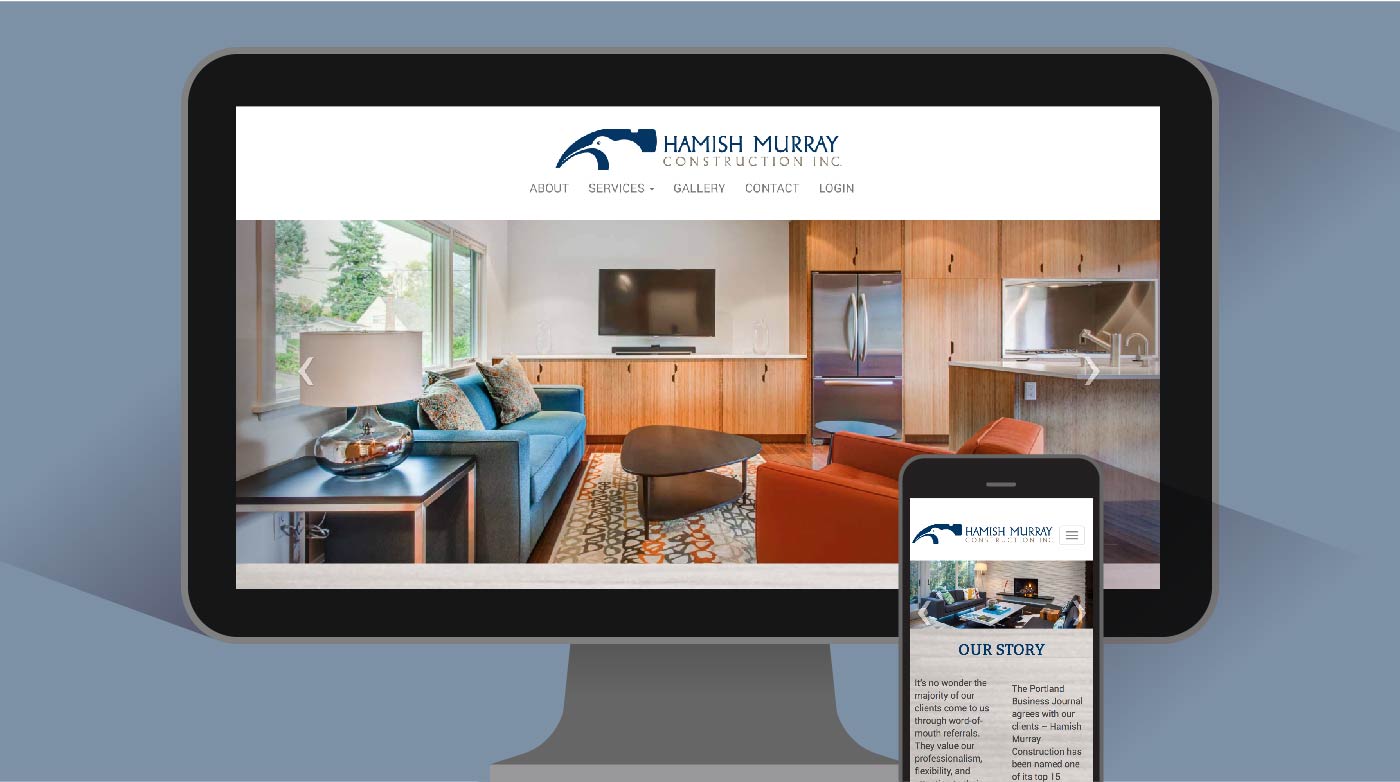
Not the fruit, of course, but the New Zealand national bird. We thought the bird also looked a bit like a hammer. Now, Hamish Murray is one of the top residential builders in Portland, according to the Portland Business Journal, and Hamish credits some of his success to the recognizability of his logo. “When we go into a neighborhood, we put up our yard signs, and people just remember us.”
It would have been easy to make a character logo that was too cute, but by balancing the eye with harmonious shapes and keeping close to the actual outlines of a kiwi and a hammer, the logo has the right amount of personality and also communicates experience and credibility.

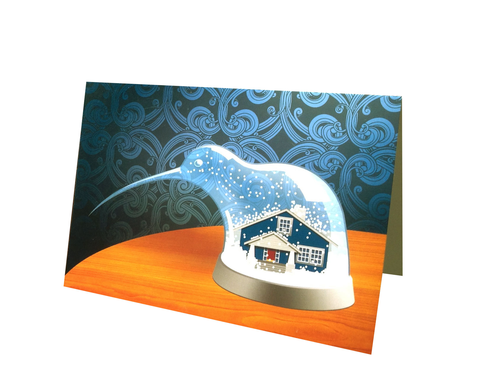
Annual custom illustration for Hamish’s holiday cards.


